You are currently browsing the daily archive for November 28, 2008.
REC, 1986, Election season. There are not many things I would like to remember from that period of blood, sweat and tears except perhaps the deep bonds of friendship we forged under fire…and my first logo.
Flashback: After the suspension/ police action that happened in our first year, it was rumoured that politicos refused to help sort out the issue because the student-body was apolitical. Anyway, soon after that NSUI and SFI units were formed in REC, and nothing would ever be the same again.
I was in B224 during the period, with Paramu, Jackie and Binod Ramakrishnan. I was a little upset about this whole politics thing, and one evening while Paramu was mugging, I had this – to use a Sangham phrase – sudden brilliant idea, ‘Let us start a movement to fight party politics in campus…Engineering Students Council Against Political Exploitation, ESCAPE for short, the tagline would be ‘Escape with us” and the logo, the letters e-s-c-a-p-e stacked to form a stairway to heaven…’
I don’t remember what exactly Paramu’s response to my idea was, but it was something on the lines of ‘smirk!’ (expression of disgust, said out loud, not a facial expression). But that very evening we were called to Thadian Vinod’s room, and briefed about the launch of…a movement that fights party politics in campus. I told him about Escape, Thadian told me the objective was not to form another party…RIP Escape.
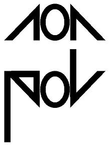
We fought two elections under Thadian, unofficially called Anti-Pols (the world referred to us as Andi Poliyans). By the time we reached the final year, we adopted a less-confrontational name, Non-Pol, and during the election season I created the Non-Pol logo, and not that anybody cared, the logo grid.
Over the years I have had the good fortune to moonlight as a graphic designer and create logos for products, events, awards, etc. Here are my personal favourites…
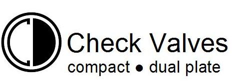
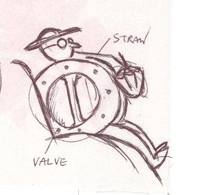
CD Check Valve. Inspired by the product. Sajeev helped refine the logo. Thanks.
Theme for 2007-08. We had the budget confab in Manali. The logo combines the contours of the hills and a growth graph (The rhyme would work only in Australia)
Logo for silver jubilee stockists. The letters 2 and 5 merge to form a valve icon.

Event logo. Started as a scribble on a napkin…

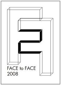
Face-to-Face. Customer Interface Programme. I was trying to fit the two Fs together and the ‘2’ suddenly popped up and hit me.
